CSS (Cascading Style Sheets) brings your website to life.
It controls colors, layouts, spacing, animations, and the entire visual experience. By learning CSS, you gain the power to transform simple HTML into beautiful, responsive, and professional designs. Explore the topics below and start building websites that truly stand out.
What is Cascading Style Sheets (CSS)?
CSS stands for Cascading Style Sheets.
CSS describes how HTML elements are to be displayed on the screen’s of desktops, laptops, tablets, mobiles, etc.
CSS is used to define styles for your web pages, including the design, layout and variations in display for different devices and screen sizes.
CSS stands for Cascading Style Sheets
CSS describes how HTML elements are to be displayed on screen, paper, or in other media
CSS saves a lot of work. It can control the layout of multiple web pages all at once
External stylesheets are stored in CSS files
CSS Syntax
A CSS rule-set consists of a selector and a declaration block:

The selector points to the HTML element you want to style. The declaration block contains one or more declarations separated by semicolons. Each declaration includes a CSS property name and a value, separated by a colon. Multiple CSS declarations are separated with semicolons, and declaration blocks are surrounded by curly braces.
Three Ways to Insert CSS
When a browser reads a style sheet, it applies the rules to the HTML and displays the webpage exactly according to the styles defined.
- Inline CSS – Styles are written inside an HTML tag using the
styleattribute.
<html>
<head></head>
<body>
<h1 style=”text-align: center;”>Hi Zailearn Viewers</h1>
<p style=”color: red;”>Inline CSS example</p>
</body>
</html>
2. Internal CSS – CSS is added inside a <style> tag in the HTML <head>.
<html>
<head>
<title>ZaiLearn.com</title>
<style>
h1 { color: blue; }
</style>
</head>
<body>
<h1>Hi Zailearn Viewers</h1>
<p>Inline CSS example</p>
</body>
</html>
3. External CSS – A separate .css file is linked to the HTML page.
How to link a CSS file with HTML file
To link a CSS file to an HTML file, use <link> element with in the HTML file <head> section with the (rel) element to set to “stylesheet” and the (href) attribute specifying the CSS file path.
<html>
<head>
<title>ZaiLearn.com</title>
<link rel=”stylesheet” href=”style.css”>
</head>
<body>
<h1>Hi Zailearn Viewers</h1>
<p>Inline CSS example</p>
</body>
</html>
CSS Selectors
The CSS element Selector
The CSS ID Selector
<h1 ID=”Zailearn”></h1>
#Zailearn{
text-align: center;
color: yellow;
}
Add Your Heading Text Here
<h1 Class=”CSS”> The New day of CSS</h1>
.CSS{
text-align:center;
color: yellow;
}
The CSS Universal Selector
The CSS Grouping Selector
The grouping selector selects all the HTML elements with the same style definitions.
Look at the following CSS code (the h1, h2, and p elements have the same style definitions):
CSS Colors
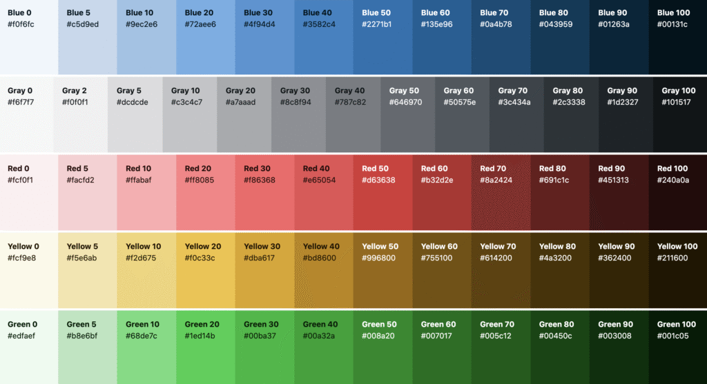
Colours are specified using predefined:
- color names
- RGB
- HEX
- RGB : An RGB color value represents RED, GREEN, and BLUE light sources. rgb(red, green, blue) Each parameter (red, green, and blue) defines the intensity of the color between 0 and 255.
- HEX: In CSS, a color can be specified using a hexadecimal value in the form: #rrggbb Where rr (red), gg (green) and bb (blue) are hexadecimal values between 00 and ff (same as decimal 0-255).
- Color Names: In CSS, a color can be specified by using a predefined color name:
CSS Backgrounds
CSS background-color
body{ Background-color : red; }
body{ Background-color : RGB(225, 0, 225);}
body{ Background-color: #ff0023;);}
CSS background-image
body { background-image : url(” zailearn.jpg”);}
CSS background-repeat
The background-repeat property repeats an image both horizontally and vertically.
Some images should be repeated only horizontally or vertically, or they will look strange.
- To repeat only horizontally we use value repeat-x.
- To repeat only vertically we use value repeat-y.
- To stop the image from repeating itself we use value no-repeat.
body{
background-image: url(“zailearn.jpg”);
background-repeat: no-repeat;
}
or
body{
background-image: url(“zailearn.jpg”);
background-repeat: repeat-X;
}
or
body{
background-image: url(“zailearn.jpg”);
background-repeat: repeat-Y;
}
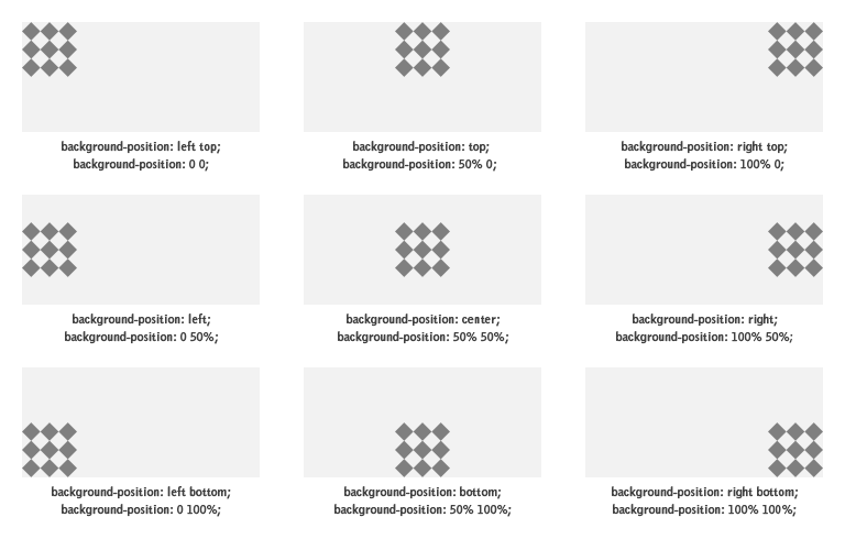
Background-position
body{
background-image: url (“zailearn.jpg”);
background-size : 50%;
background-repeat: no-repeat;
background-position: right top;
}
Background-size
The background-size property sets the size of the element’s background image. The image can be left to its natural size, stretched or constrained to the fit the available space
The value for background-size can be:
- Length and width in percentage or pixels
- Cover
- auto
- length
- initial
- inherit;
- contain
body{
background-image : url (“zailearn.jpg”);
background-size: 50%;
}
Background-Attachment
body{
background-image: url(“zailearn.jpg”);
background-size: 50%;
background-repeat: no-repeat;
background-position: right top;
background-attachment: fixed;
}
or
body{
background-image: url(“zailearn.jpg”);
background-size: 50%;
background-repeat: no-repeat;
background-position: right top;
background-attachment: Scroll;
}
CSS background - Shorthand property
To shorten the code, it is also possible to specify all the background properties in one single property. This is called a shorthand property.
When using the shorthand property the order of the property values is:
- background-color
- background-image
- background-repeat
- background-attachment
- background-position
body{
background-image: url(“zailearn.jpg”);
background-size: 50%;
background-repeat: no-repeat;
background-position: right top;
background-attachment: fixed;
}
We can write short hands like
body{ background-image: url(“Zailearn.jpg”) 50% no-repeat right top scroll;}
CSS Border
The CSS border properties allow you to specify the style, width, and color of an element’s border.
CSS border-style
Example:
Demonstration of the different border styles
<html>
<head>
<title>Border Dotted Example</title>
<style>
p.dotted { border-style: dotted;}
</style>
</head>
<body>
<p class=”dotted”> A Dotted Border.
</body>
</html>
<html>
<head>
<title>Border Dotted Example</title>
<style>
p.dotted { border-style: dashed;}
</style>
</head>
<body>
<p class=”dotted”> A Dotted Border.
</body>
</html>
<html>
<head>
<title>Border Dotted Example</title>
<style>
p.dotted { border-style: solid;}
</style>
</head>
<body>
<p class=”dotted”> A Dotted Border.
</body>
</html>
<html>
<head>
<title>Border Dotted Example</title>
<style>
p.dotted { border-style: double ;}
</style>
</head>
<body>
<p class=”dotted”> A Dotted Border.
</body>
</html>
<html>
<head>
<title>Border Dotted Example</title>
<style>
p.dotted { border-style: none;}
</style>
</head>
<body>
<p class=”dotted”> A Dotted Border.
</body>
</html>
<html>
<head>
<title>Border Dotted Example</title>
<style>
p.dotted { border-style: hidden;}
</style>
</head>
<body>
<p class=”dotted”> A Dotted Border.
</body>
</html>
CSS Border-Width
<html>
<head>
<title>Border Dotted Example</title>
<style>
h1 { border-style: Solid;
border-width: 2px;
}
</style>
</head>
<body>
<h1> A Dotted Border.</h1>
</body>
</html>
CSS Border-Color
<html>
<head>
<title>Border Dotted Example</title>
<style>
h1 { border-style: Solid;
border-width: 2px;
border-color: red;
}
</style>
</head>
<body>
<h1> A Dotted Border.</h1>
</body>
</html>
CSS Border – Sides
<html>
<head>
<title>Border Dotted Example</title>
<style>
h1 { border- top-style: Solid;
border- right-style: Solid;
border- bottom-style: Solid;
border- left -style: Solid;
}
</style>
</head>
<body>
<h1> A Dotted Border.</h1>
</body>
</html>
CSS Border - Shorthand Property
Syntax
<style>
h1 {
border: Size Type Color;
}
</style>
Example
<html>
<head>
<title>Border Dotted Example</title>
<style>
h1 {
border: 2px Solid red;
}
</style>
</head>
<body>
<h1> A Dotted Border.</h1>
</body>
</html>
Border Radius
Syntax
<style>
h1 {
border: Size Type Color;
border-radius: 5px;
}
</style>
Example
CSS Box Model
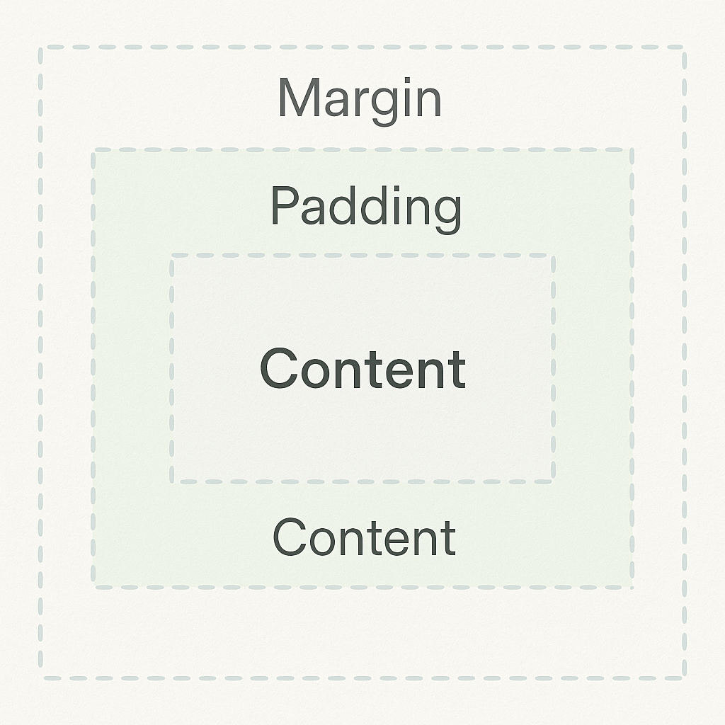
In CSS, the term “box model” is used when talking about design and layout.The CSS box model is essentially a box that wraps around every HTML element. It consists of: content, padding, borders and margins.Explanation of the different parts:
- Content – The content of the box, where text and images appear
- Padding – Clears an area around the content. The padding is transparent
- Border – A border that goes around the padding and content
- Margin – Clears an area outside the border. The margin is transparent
The box model allows us to add a border around elements, and to define space between elements.
CSS Margins
<style>
h1 {
Margin-bottom: 35px; Margin-right: 30px;
Margin-top: 25px;
Margin-left: 40px;
}
</style>
CSS Padding
<style>
h1 {
Padding-bottom: 35px; Padding-right: 30px;
Padding-top: 25px;
Padding-left: 40px;
}
</style>
CSS height and Width
<style>
div {
Width: 60px;
height: 90px;
background-color: red;
}
</style>
CSS Text Spacing
Text Indentation
P{
text-indent: 50px;
}
Letter Spacing
P{
Letter-spacing: 5px;
}
Line Height
P{
line-height: 1.8;
}
Word Spacing
The word-spacing property is used to specify the space between the words in a text. The following example demonstrates how to increase or decrease the space between words:
P{
Word-spacing: 10px;
}
White Space
P{
white-space: nowrap;
}
CSS Font
CSS font properties let you style and control the appearance of text in an HTML document. They are essential for creating a visually appealing and readable website.
Here’s a breakdown of the most common CSS font properties:
Font family:
- Purpose: Specifies the typeface for your text.
- Details: Lists fonts in order of preference. If the first font isn’t available, the browser tries the next one. The generic font family (like serif, sans-serif, monospace, etc.) acts as a fallback.
Example
Font Size
- Purpose: Sets the size of the text.
- Details: You can use various units:
- px (pixels) for fixed sizes
- em or rem for scalable, relative sizes
- % for percentages based on parent elements
Example
Font Weight
- Purpose: Adjusts the thickness or boldness of the text.
- Values:
- Named weights: normal, bold, bolder, lighter
- Numeric values: 100 (thin) to 900 (extra bold)
Example
Font Style
- Purpose: Specifies the style of the text, often used for italics.
- Values: normal, italic, oblique
Example
Font Variant
- Purpose: Controls the appearance of small-caps text.
- Details: small-caps displays lowercase letters in a smaller uppercase format.
Example
Parallax effect
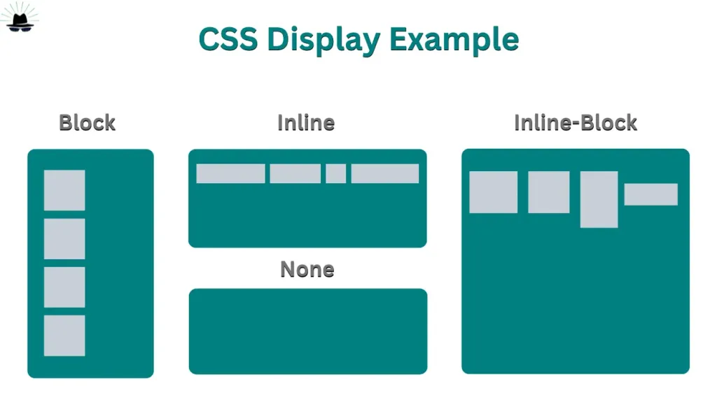
CSS Display Property.
Display Block
The block value of the display property forces an element to behave like block-level element, like a <div> or <p> element. The style rules in the following example displays the <span> and <a> elements as block-level elements:
Example:
#A1{
display: block
}
Display Inline
The inline value of the display property causes an element to behave as though it were an inline-level element, like a <span> or an <a> element. The style rules in the following example displays the <p> and <li> elements as inline-level elements:
Example:
#A1{
display: inline;
}
Display Inline-Block
Display: none;
display: none; is commonly used with JavaScript to hide and show elements without deleting and recreating them.
Example:
#A1{
display:none;
}
The position Property
Positioning elements appropriately on the web pages is a necessity for a good layout design. There are several methods in CSS that you can use for positioning elements. The following section will describe you these positioning methods one by one.
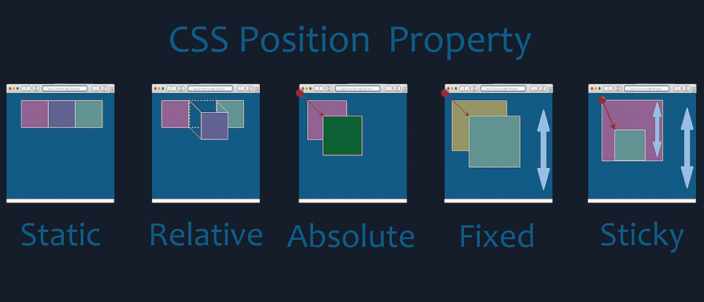
Relative Positioning
A relative positioned element is positioned relative to its normal position.
In the relative positioning scheme the element’s box position is calculated according to the normal flow. Then the box is shifted from this normal position according to the properties — top or bottom and/or left or right.
Absolute Positioning
An absolutely positioned element is positioned relative to the first parent element that has a position other than static. If no such element is found, it will be positioned on a page relative to the ‘top-left’ corner of the browser window. The box’s offsets further can be specified using one or more of the properties top, right, bottom, and left.
Fixed Positioning
Fixed positioning is a subcategory of absolute positioning.
The only difference is, a fixed positioned element is fixed with respect to the browser’s viewport and does not move when scrolled.
Sticky Positioning
CSS allows an element to behave like both relative and fixed positioning. It stays in its normal flow until the user scrolls to a specific point, then it sticks to a defined position (like the top) and remains visible. This is useful for menus, headers, sidebars, and important notices. To use it, you apply position: sticky; and set a direction such as top: 0;. Sticky elements depend on their parent container, so they only stick within that section. It improves user experience by keeping key content accessible during scrolling.
How to make Android App logo.
CSS List properties
There are two types of CSS list:
OL: Ordered list which follows a sequency order like Numbers, Alphabets and etc.
UL: Unordered list items are market with round bullets.
There are three important style properties for ordered and unordered list.
list-style-type: types of bullets.
list-style-position: to set position of the bullets points
list-style-image: to set a background image for the bullet list type.
List-style-type:
Ordered list
Ordered list:
decimal
decimal-leading-zero
lower-roman
upper-roman
lower-alphabets
upper-alphabets
HTML View :
<h3>Ordered List (OL)</h3>
<ol>
<li>Introduction</li>
<li>Basics</li>
<li>Advanced Topics</li>
</ol>
CSS View :
ol {
list-style-type: decimal;}
ol li {
margin: 6px 0;
font-weight: 500;
}
Unordered list
Unordered list:
disc
square
circle
HTML View:
<h3>Unordered List (UL)</h3>
<ul class=”my-ul”>
<li>HTML</li>
<li>CSS</li>
<li>JavaScript</li>
</ul>
CSS View:
.my-ul {
list-style-type: square;
}
.my-ul li {
margin: 6px 0;
font-weight: 500;
}
List-style-Position:
Add Your Heading Text Here
The line is position outside of the list items boxes, by defult. however you can use the list-style-position property to specify whether the bullet points appear inside or outside of the list item block boxes.
HTML View:
<h3>List-Style-Position: Outside</h3>
<ul class=”outside-list”>
<li>This is an item with the marker outside.</li>
<li>The bullet stays outside the content box.</li>
</ul>
<h3>List-Style-Position: Inside</h3>
<ul class=”inside-list”>
<li>This is an item with the marker inside.</li>
<li>The text starts under the bullet.</li>
</ul>
CSS View:
.outside-list {
list-style-position: outside;
background: #e3f2fd;
padding: 15px;
border-radius: 10px;
font-family: “Poppins”, sans-serif;
}
.inside-list {
list-style-position: inside;
background: #fff3e0;
padding: 15px;
border-radius: 10px;
font-family: “Poppins”, sans-serif;
}
li {
margin: 8px 0;
font-weight: 500;
}
List-style-image:
You can set a background image (icons) in place of the item marker using the list-style-image property.
HTML View:
<ul class=”img-list”>
<li>HTML</li>
<li>CSS</li>
<li>JavaScript</li>
</ul>
CSS View:
.img-list {
list-style-image: url(‘https://cdn-icons-png.flaticon.com/512/1828/1828884.png’);
padding: 15px 25px;
background: #e8f5e9;
border-radius: 10px;
font-family: “Poppins”, sans-serif;
}
Creating Navigation Menus Using Lists
CSS Table properties
When you build an HTML table without any style or attributes, browser display them without any border. Styling a table with CSS can greatly improve its appearance.
Collapse table border
Every table cell has separate borders as well as there is some space between the borders of adjacent table cells. It happens because table cell borders are separate by default. But, we can collapse the separate borders into one by using the borer-collapse property.
Example
table,td,th{
border:1px solid black;
border-collapse: collapse;
}
Colors specific rows in the table
tr:nth-child(3)
{
background-color: black;
color:white;
}
Add Your Heading Text Here
To highlight alternative rows of the table, it can be even rows or odd rows
For odd rows
tr:nth-child(odd)
{
background-color: black;
color:white;
}
For even rows
tr:nth-child(even)
{
background-color: black;
color:white;
}
Controlling the table layout
By default, a table expands and indentures to accommodate the data contained inside it. As data fills inside the table, it continues to expand as long as there is space. However, it is necessary to set a fixed width for the table in order to manage the layout.
The CSS table-layout defines the algorithm to be used to layout the table cells, rows and columns.
This property can take two values:
Auto
Fixed
Example:
table{
width:500px;
table-layout: fixed;
}
Forms
CSS Animation
What Are CSS Animations?
CSS animations allow HTML elements to change from one style to another without using JavaScript or Flash.
An animation lets an element gradually change from one style to another.
You can change as many CSS properties as you want, as many times as you want.
To use CSS animation, you must first specify keyframes for the animation.
Keyframes hold what styles the element will have at certain times.
The @keyframes Rule
When you specify CSS styles inside @keyframes, the animation will gradually change from the current style to the new style at specific points in time.
Example:
@keyframes example {
from { background-color: red; }
to { background-color: yellow; }
}
Binding Animation to an Element
To get an animation to work, you must bind the animation to an element.
Note:
If the animation-duration property is not specified, no animation will occur because its default value is 0s.
Example:
div {
width: 100px;
height: 100px;
background-color: red;
animation-name: example;
animation-duration: 4s;
}
Using Percentages in Keyframes
You can use percentages to add multiple style changes during the animation.
Example:
@keyframes example {
0% { background-color: red; }
25% { background-color: blue; }
50% { background-color: green; }
75% { background-color: purple; }
100% { background-color: yellow; }
}
CSS Animation Properties
1. animation-name
Specifies the name of the animation.
2. animation-duration
Defines how long an animation should take to complete.
3. animation-delay
Specifies a delay before the animation starts.
4. animation-iteration-count
Specifies how many times the animation should run.
5. animation-direction
Specifies whether the animation should play forward, backward, or alternate.
6. animation-timing-function
Specifies the speed curve of the animation (e.g., linear, ease).
7. animation-fill-mode
Specifies what style the element should have before the animation starts or after it ends.
8. animation (shorthand)
Used to combine multiple animation properties into one.
Delay an Animation
The animation-delay property adds a delay before the animation starts.
Example:
animation-iteration-count: 3;
Or
infinite:
animation-iteration-count: infinite;Example:
<style>
div {
height: 100px;
width: 100px;
background-color: greenyellow;
margin: 200px auto;
animation-name: animate;
animation-duration: 10s;
}
@keyframes animate {
from {
background-color: greenyellow;
border-radius: 0px;
}
to {
background-color: blue;
border-radius: 50px;
}
}
</style>
Want to join?
Find a team of digital marketers you can rely on. Every day, we build trust through communication, transparency, and results.


